Good software makes the next step obvious.
Status, ownership and action should live in the same conversation. A calmer interface starts with the questions a team asks every day.
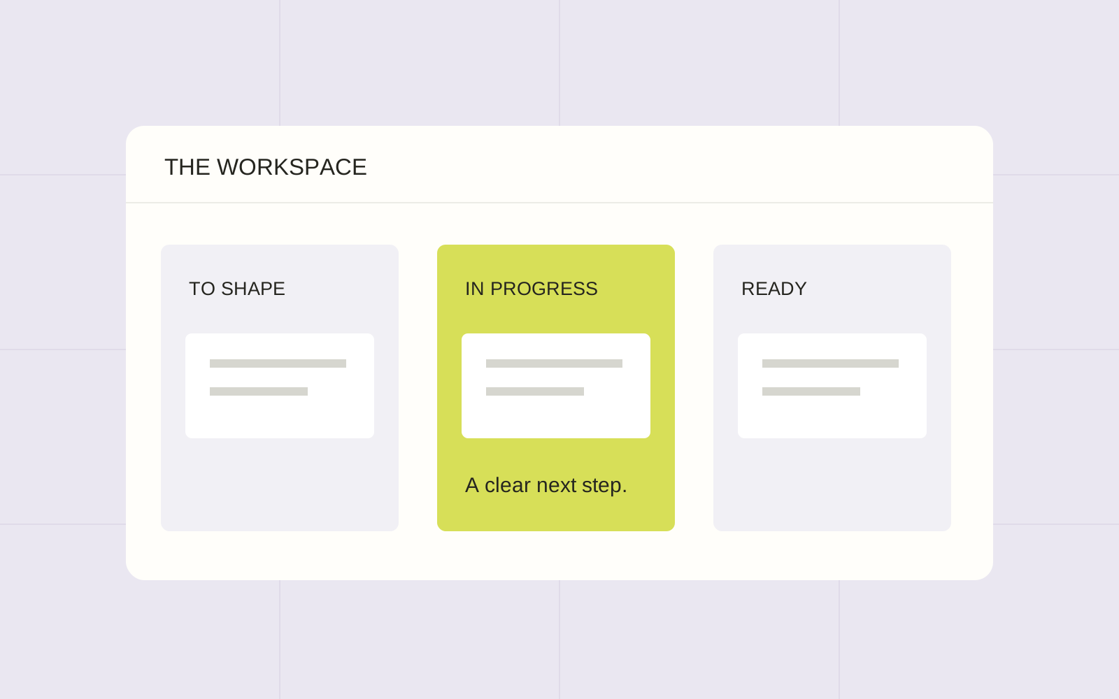
Ask what the overview needs to answer.
A dashboard can show a great deal without helping someone make a decision. Before choosing cards or charts, write the questions the overview should answer. What needs attention? Who owns it? What can happen next? The answers provide a better starting point than filling every available space.
Consider a project workspace. A list of work waiting for review may be more useful than a large total. A clear owner may matter more than another colour. Begin with the decisions people need to make, then choose the smallest set of information that helps them make those decisions.
Use states that mean something.
A status label should explain the state of the work, not simply decorate a card. Agree what makes an item ready, what keeps it blocked and who can move it forward. Keep those meanings consistent wherever the item appears.
Do not rely on colour alone to communicate that distinction. Pair the treatment with plain words and a visible action where appropriate. Test long task names, missing owners and empty lists. These ordinary variations are part of the product, so they should be part of its design review too.
A useful dashboard helps someone decide, not just observe.
Endgame perspective
Let the details open at the right moment.
An overview and a detail view have different jobs. The first helps someone choose where to look; the second helps them understand and act. It is reasonable for the detail view to contain more information, provided the route back remains clear and the main terms do not change.
Think through permissions and consequences before adding an action. Explain what will change and give the user a chance to review an important decision. Where an action can be undone, make that route visible. A polished animation is not a substitute for knowing what a control will do.
Build a vocabulary the team can maintain.
Reusable interface patterns are useful when they reflect shared meanings. Document the labels, states and common actions, then keep the examples close to the working product. A component collection without those decisions can still produce inconsistent screens.
Review the next feature against that vocabulary. Reuse what already answers the question; introduce a new pattern when the task genuinely differs. The goal is not to make all software look alike. It is to make a particular product feel understandable as it grows.